Looklab/Trends
Fashion trend research platform for independent retailers.
Refined Aug 2025

Overview
Problem
In fashion, trends can fade within a few seasons. For independent retailers, one wrong bet can lead to clothes no one wants and money they can’t get back. With limited time and resources for trend evaluation, they rely on gut instinct for buying decisions, which can lead to unsold inventory, lost capital, and weakened brand loyalty.
Solution
We designed a trend analysis platform that unites cultural context, social influences, and product recommendations in one place, helping retailers save time and make informed, brand-aligned decisions with confidence.
Trend Discovery & Lifecycle Tracking
Browse seasonal trends with lifecycle indicators to anticipate market shifts and make strategic inventory decisions.
Cultural Context & Trend Analysis
View trend information including cultural context, historical influences, and specific elements (color, fabric, silhouette) to evaluate brand and customer alignment.
Visual Inspiration & Product Sourcing
Browse runway images for merchandising inspiration alongside curated product suggestions to streamline the research-to-sourcing workflow within a single platform.
Our Approach
Research
Interviews
Affinity Mapping
Personas
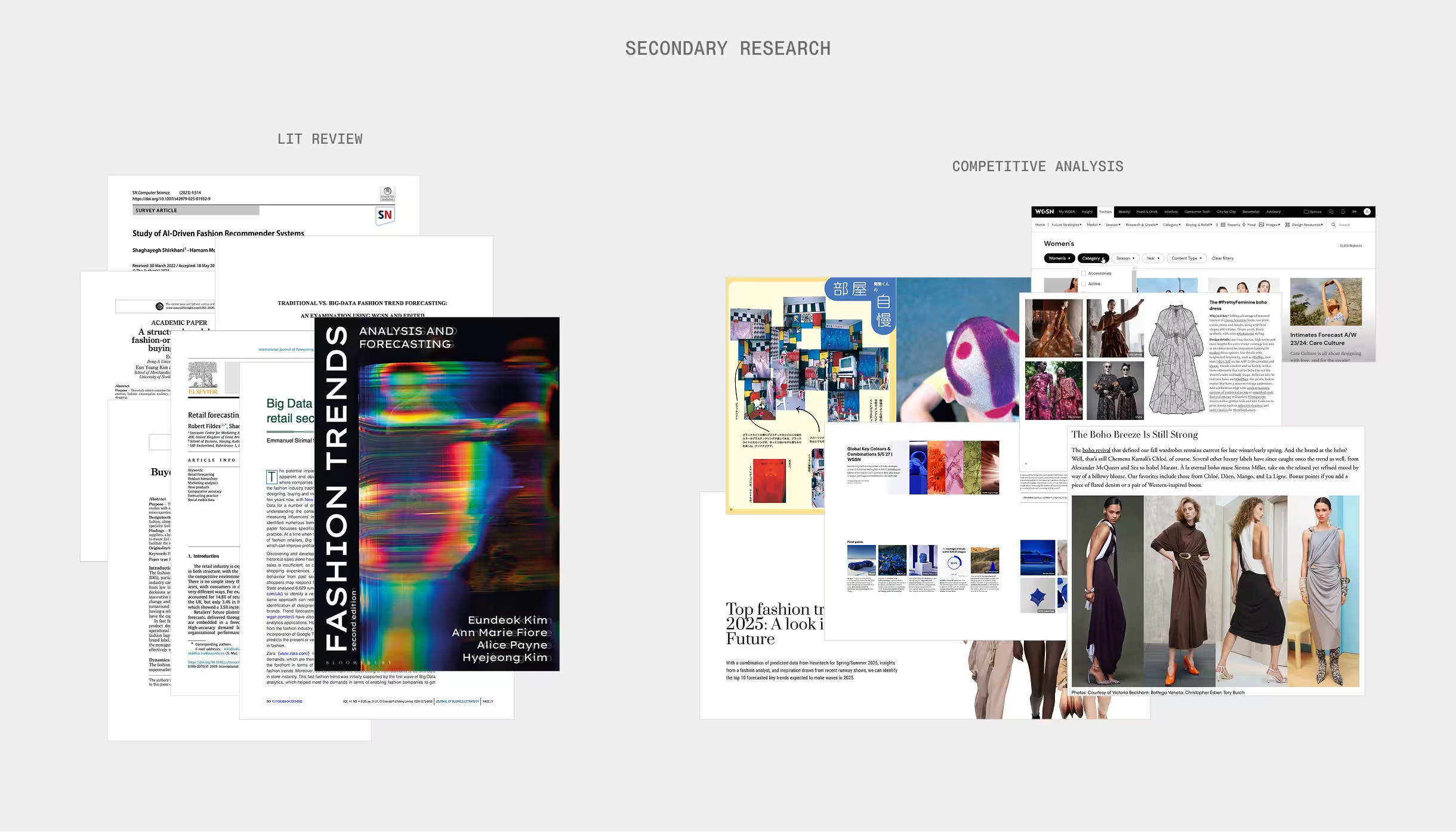
Competitive Analysis
Literature Review
Design
Brainstorming
Sketching
Concept Test
High-fi Design
Interactive Prototype
Evaluate
Usability Testing
Design Iterations
My Contribution
I conducted literature reviews and competitive analysis independently, while collaborating on interviews and usability testing with my team. I led the complete design of the trends feature from concept to high-fidelity prototype and continued iterating on the design after the official project timeline ended.
jump to prototypeResearch
interivews, competitive analysis, & literature review
The Hemline Index suggests skirts rise in economic booms and fall in downturns, showing that fashion trends mirror broader cultural, political, and economic shifts.
To understand how retailers navigate these ever-changing forces, I conducted interviews with six independent boutique owners, complemented by a literature review and competitive analysis. My goal was to learn how small retailers evaluate trends and maintain brand authenticity in a fast-moving fashion landscape.
What I found is that retailers are cautious trend adopters. They selectively incorporate elements that align with their identity, balancing cultural awareness with authenticity.
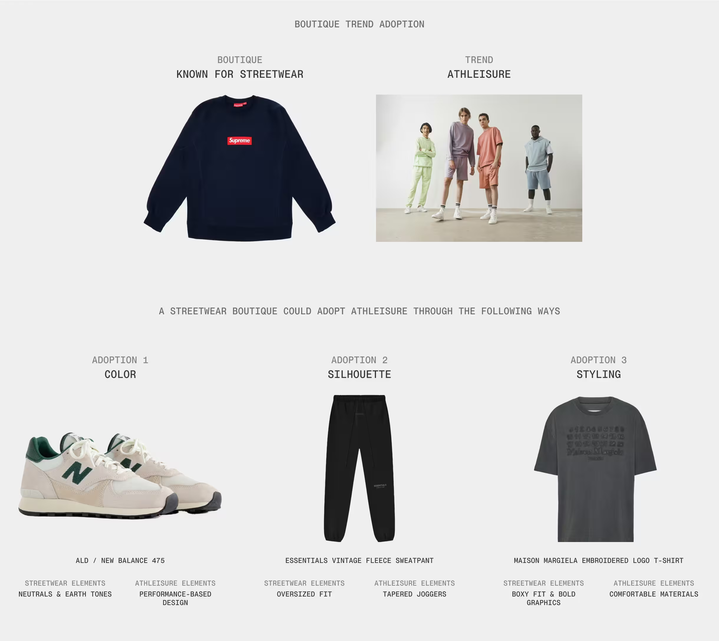
Yet, while trends clearly respond to the cultural zeitgeist—shaped by economics, politics, and social movements—trend forecasting rarely relies on data. Instead, it draws from emotion, cultural storytelling, and visual imagery, often pulled from runway collections. Existing tools like WGSN capture this through detailed cultural analysis but remain inaccessible to small retailers due to exorbitant costs (~$80,000/yr).
These findings revealed an opportunity for a visually led, culturally contextual, and more accessible way to evaluate trends—one that empowers retailers to make confident, brand-aligned buying decisions without sacrificing time or identity.
Design
Ideation
After synthesizing the research, we brainstormed potential approaches for the trends feature
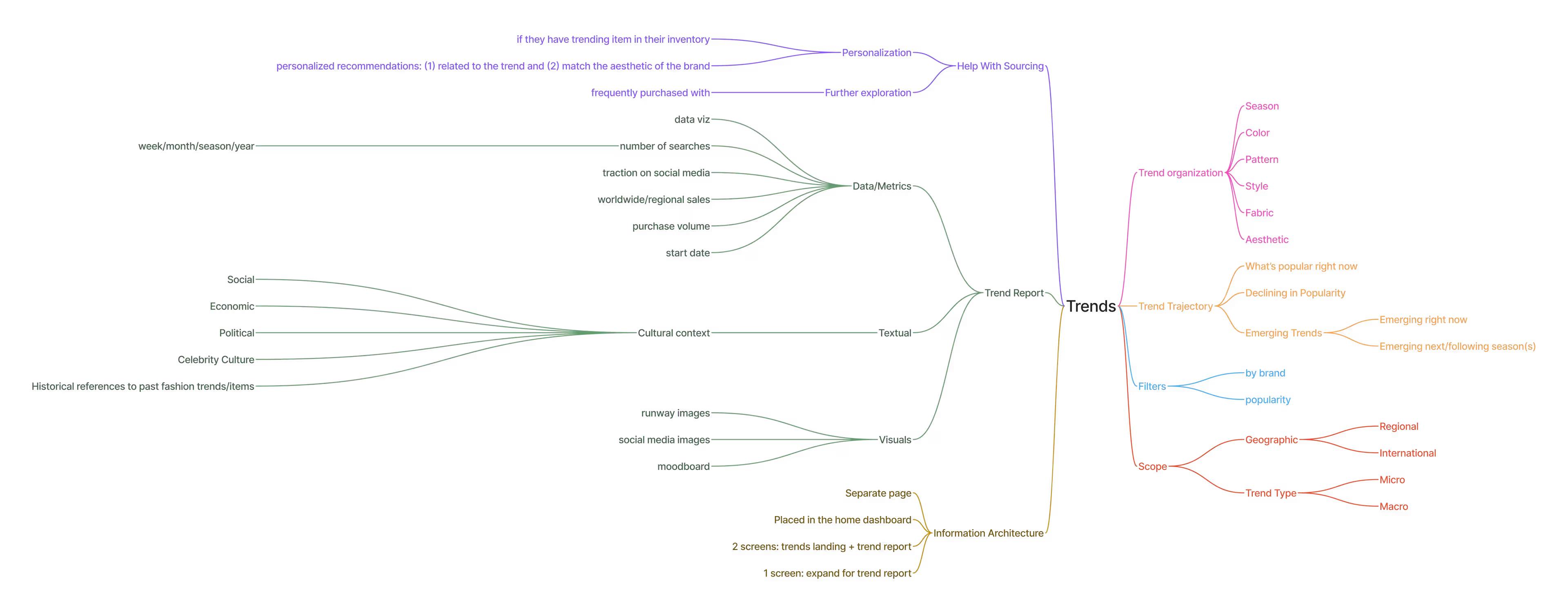
and landed on 4 concepts.
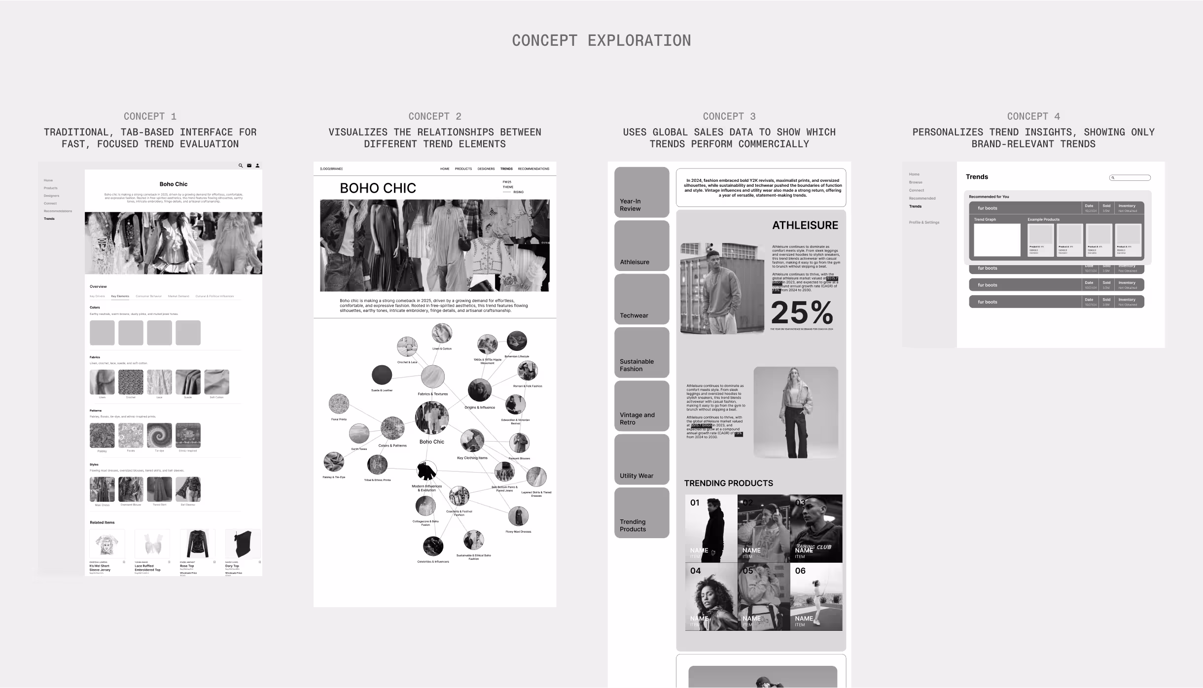
Concept Selection
Our client was drawn to concept 2 for its editorial quality and visual storytelling, likening it to exploring a fashion magazine rather than a standard interface. The team chose this direction because it captures the cultural systems that drive fashion trends, aligning with our goal to make trend evaluation both insightful and visually engaging
Design Rationale
Retailers reference multiple sources but lack time to synthesize them. The Modal Map brings core trend elements—color, fabric, style, cultural influences, and origins—into a single interface and visualizes their relationships. This structure emphasizes influential elements, helping retailers allocate limited time and budgets towards high-impact opportunities.
Design Trade-offs
The nodal interface condenses trends into a single view. It can feel overwhelming at first, but fashion itself is interconnected: cultural movements influence fabrics, economic shifts shape colors, and these relationships define brand fit. Separating these elements would make navigation easier but limit understanding. Retailers need to see how each component connects to adapt trends selectively, understanding not just what’s trending but why and how it fits their identity.
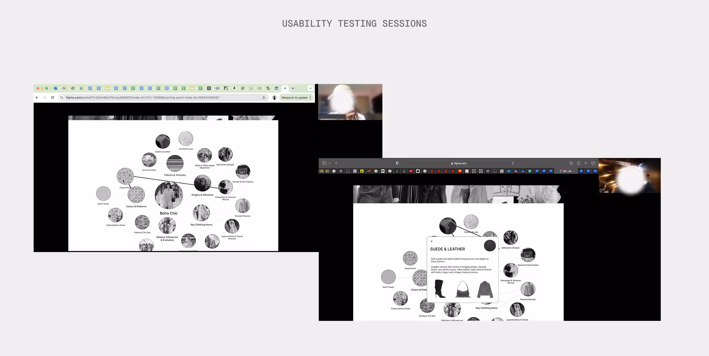
Usability Testing
Usability Testing
We conducted moderated usability sessions with six participants (four boutique owners, two corporate buyers) to assess clarity, credibility, and usefulness. Each task was tied to a design objective to evaluate how well the solution met user needs.
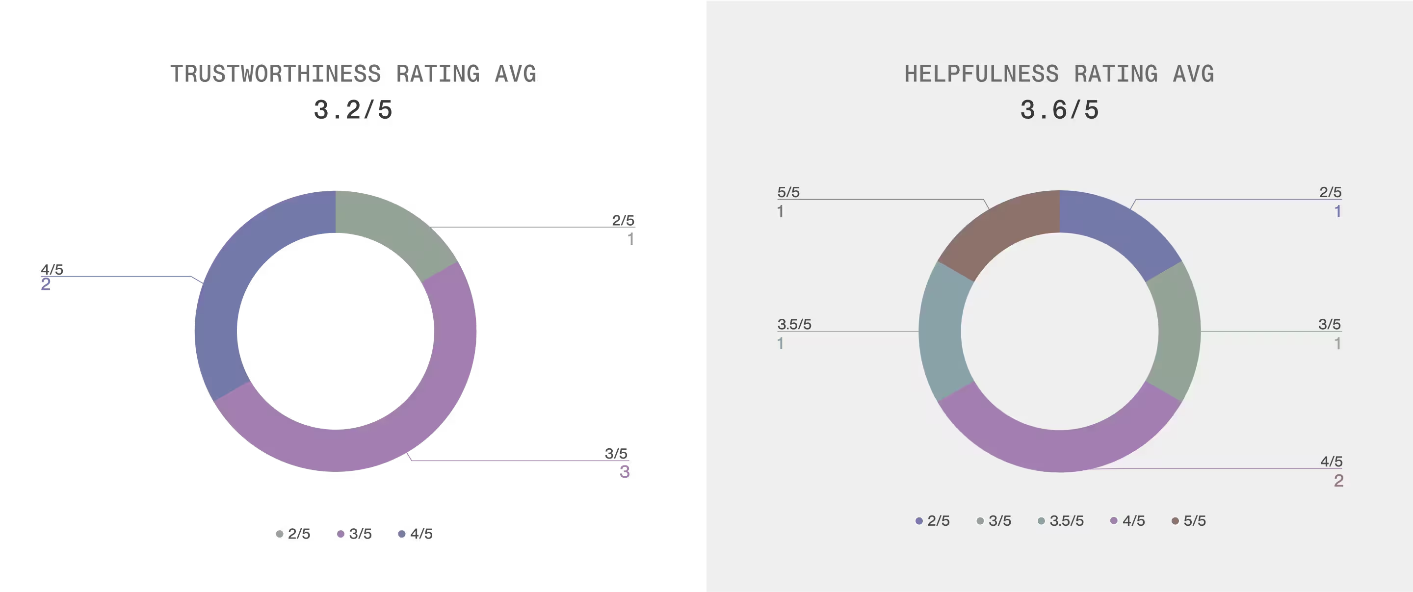
Usability Testing Results
Testing yielded mixed feedback with helpfulness at 3.6/5 and trustworthiness at 3.2/5.
Iterations
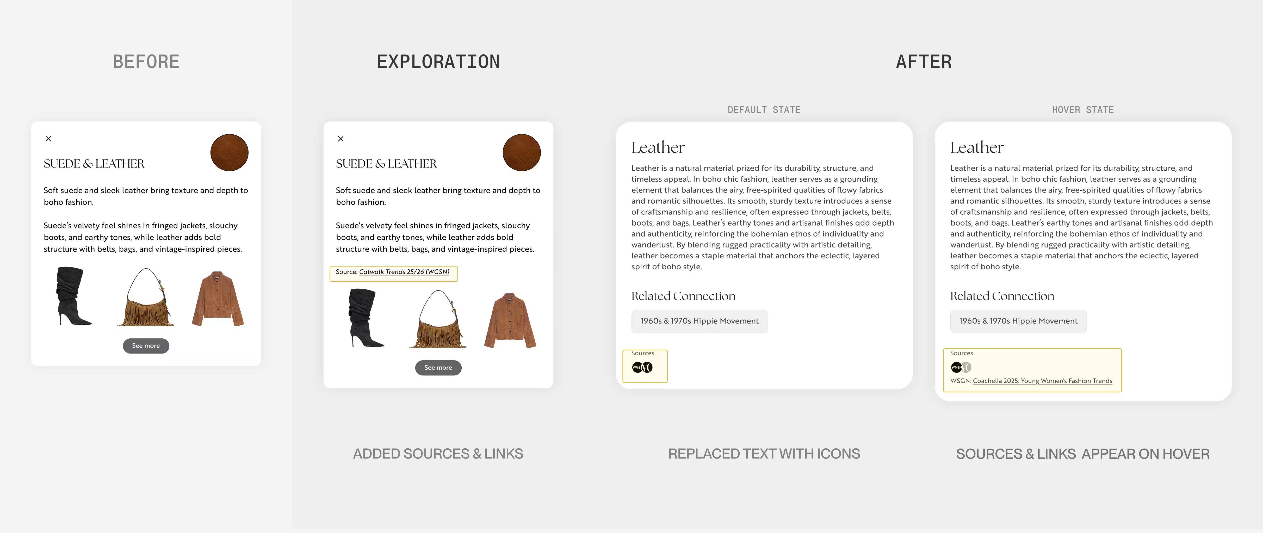
Establishing Trust & Credibility
Missing data sources reduced user trust. I initially omitted citations, assuming users would trust the platform to manage data validity behind the scenes. Feedback revealed that transparency is essential for building trust, especially when decisions carry financial risk. I addressed this by adding references from established fashion magazines and using logos for instant source recognition. For retailers making high-stakes purchases, credible sourcing strengthens confidence.
Enhancing Discovery
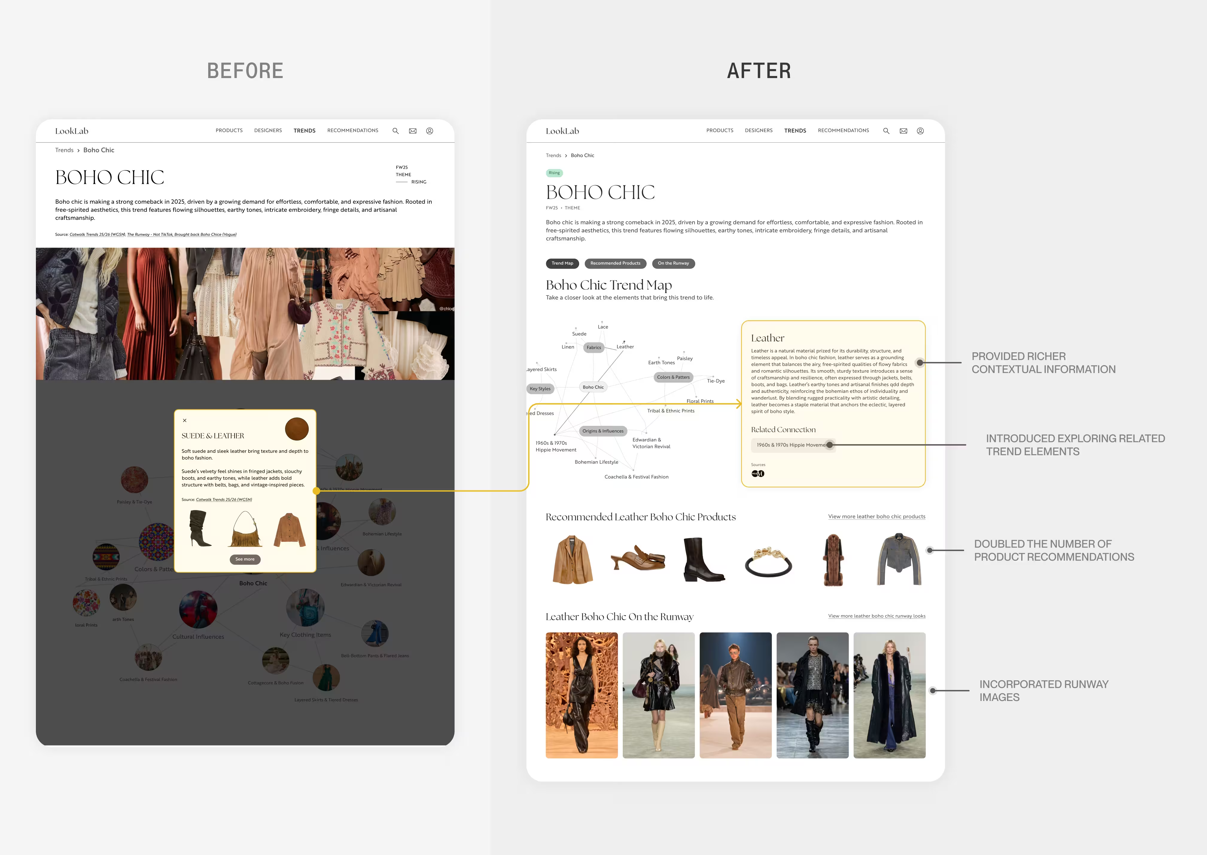
Testing revealed that users wanted more product recommendations and contextual information to understand how trends translate into actual store implementation. I addressed this through expanding the contextual information, adding runway images, and including more product recommendations per trend element. This will give retailers clearer use cases and a faster path from trend discovery to sourcing and merchandise planning.
Reducing Cognitive Load
I realized my attempt to reduce reading time by showing everything at once was actually overwhelming users. Two issues drove this: visual clutter from node images and weak hover states that didn't clearly guide attention. I removed the images and strengthened the hover/focus states by dimming non-active nodes, directing users' focus to one element at a time.
Providing Shortcuts
User feedback revealed different information priorities: some participants immediately looked for product recommendations while others wanted to explore cultural context first. During testing, I noticed users scanning the interface for quick access to sourcing information. I redesigned the interface to provide a direct shortcut to product recommendations for efficiency-focused users, while preserving rich contextual content for those seeking deeper trend analysis.
Eliminating Popups
The previous design required users to close popups each time they explored a node, creating a repetitive interaction friction. I removed popups entirely and embedded the content directly into the main interface, freeing up space and eliminating interruptions. This reduces both physical and cognitive effort, allowing users to navigate between nodes seamlessly without breaking their research flow.
Prototype
Impact
Validating the Core Concept
Testing confirmed that visualizing trend relationships met a real user need. Boutique owners said the nodes “act like a snapshot of the trend,” suggesting greater confidence in purchasing decisions.
Identifying and Addressing Key Usability Barriers
Early testing revealed trust and cognitive load issues (trustworthiness 3.2/5). I refined source transparency, hierarchy, and interactions to reduce complexity and guide focus. Follow-up testing would validate improvements in user confidence.
Defining Future Success Metrics
If launched, success would be measured by a 50% reduction in research time, higher user confidence, stronger adoption and retention, and fewer unsold items through improved trend evaluation.
Reflection
This was my first 0→1 project, and it taught me how much scope and timing shape outcomes. We tried to meet every client goal at once, which stretched our capacity. Looking back, earlier testing and smaller iterations would have given us clarity sooner. Next time, I’ll focus on scope and faster prototyping in order to validate concepts earlier in the process.