Side Biscuit
Bringing Side Biscuit's energetic personality online while improving search visibility and conversions.
Overview
Context
This project originated as a semester-long project for an Interaction Design course at the University of Michigan that evolved into a client project with Side Biscuit, an Ann Arbor fried chicken restaurant.
Problem
Side Biscuit's website hadn't been updated since launching in 2020. It no longer reflected the brand's vibrant personality nor communicated what made them unique. The primary CTA was difficult to read and less prominent than third-party delivery options, directing customers away from direct ordering. Lack of SEO made the site difficult for new customers to discover online.
Solution
To re-establish Side Biscuit’s personality and increase direct orders, we refreshed the site’s voice, structure, and discoverability. The redesign emphasized local culture, clear product information, and intuitive paths to order, resulting in a site that feels authentic and drives conversion.
Outcome
Our Approach
Research
Stakeholder Interviews
Heuristic Evaluation
Competitive Analysis
Design
Content Strategy
Sketching
Concept Test
High-fi Design
Interactive Prototype
Implementation
HTML • CSS • JavaScript
Square Integration
Live Deployment
Evaluate
Post-launch Metrics
My Contribution
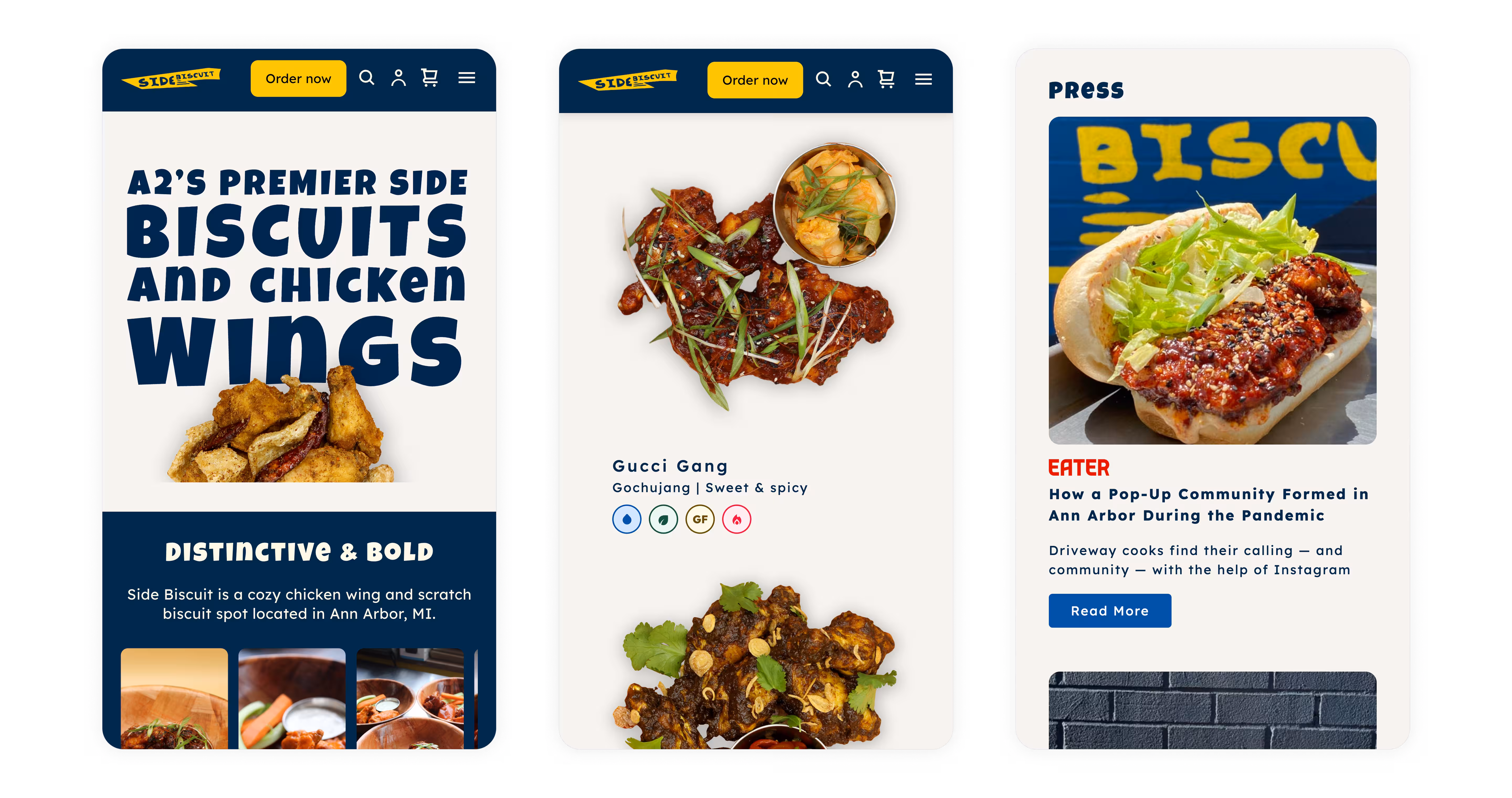
I contributed to research and discovery, led content strategy, and wrote copy to define the brand voice. I designed and built the homepage and sauces page, addressing accessibility issues, guiding users to direct ordering, and bringing the brand’s personality online within Square’s constraints.
visit side biscuit's websiteResearch
Stakeholder Interviews
Over 10 weeks of collaboration with Jordan, we uncovered opportunities to strengthen direct online ordering, improve local search visibility, and highlight rotating sauces as a core differentiator. Because Side Biscuit sits off campus and relies heavily on digital discovery, poor SEO left it buried beneath chain competitors. The redesign needed to help residents and students easily find the brand and understand what makes it worth the trip.
Heuristic Evaluation
To identify usability and accessibility gaps in the existing site, I conducted a heuristic evaluation using Nielsen’s principles. The audit revealed four key issues: (1) low contrast on the primary CTA, (2) competing calls-to-action that weakened focus, (3) a lack of brand expression, and (4) hidden sauce names that required unnecessary interaction. These findings guided early redesign priorities, emphasizing clarity, accessibility, and stronger brand communication.

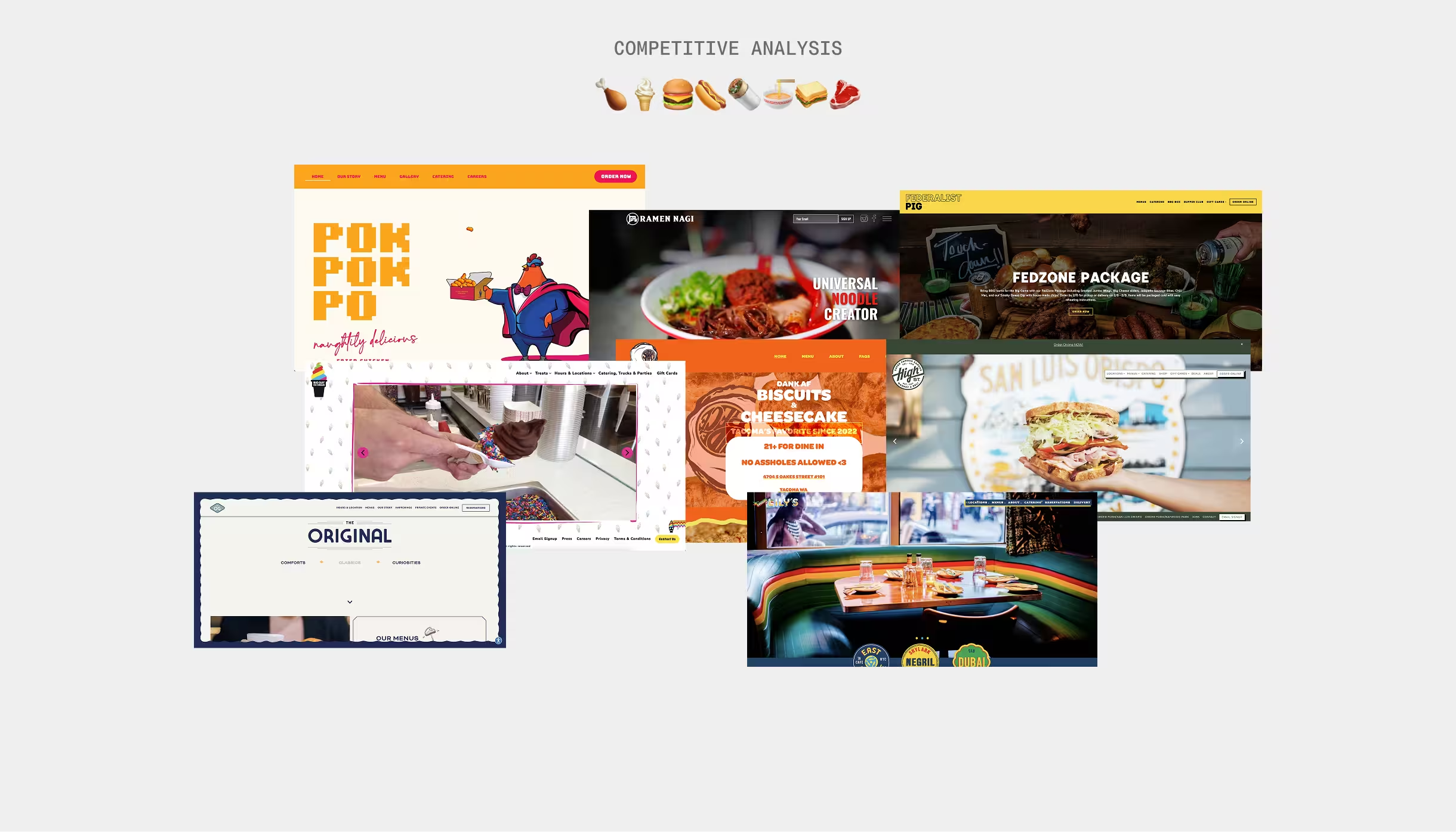
Competitive Analysis
A competitive review of local and national restaurants revealed gaps in brand storytelling, SEO, and visual quality. These findings guided our strategy to make Side Biscuit’s site more discoverable and expressive of its unique personality.
Design
Content Strategy
I led content strategy across all pages, establishing brand voice and implementing SEO to improve discoverability while expressing Side Biscuit's personality.
Brand Voice
I immersed myself in Side Biscuit’s sports and hip-hop culture to craft an authentic yet inclusive brand voice. Learning the community’s language informed three guiding principles that shaped all website copy.
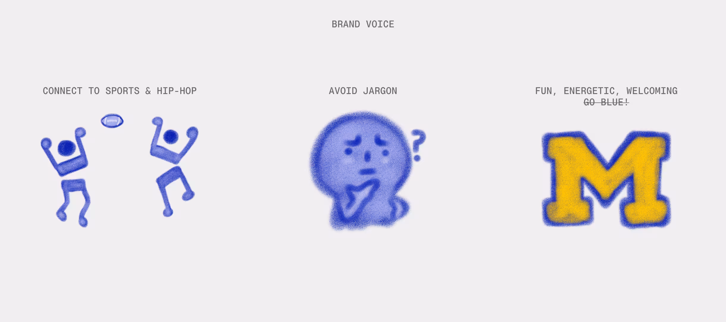
These principles guided the website’s copy, transforming generic text into brand-aligned content that reflected Jordan's passion for sports and hip-hop while remaining inclusive for all customers.
SEO Implementation
We implemented foundational SEO across the site, adding meta descriptions, location-based keywords (“Ann Arbor”), and product terms (“chicken wings”). Alt text was optimized for clarity and relevance. Since the site previously lacked SEO, these updates significantly improved discoverability.
Design Decisions
Color Palette & Typography
Since Side Biscuit takes inspiration from the University of Michigan, we used the university’s maize and blue. We selected "Luckiest Guy" for headers (bold, sports-inspired) and "Lexend" for body text to balance the energy with readability.
Animations
I added animations throughout the site: spinning star CTA (draws attention to direct ordering), moving press carousel (social proof), animated sauce scorecard (highlights 200+ flavors), parallax scrolling wing (playful hint), and running bull footer (Easter egg honoring Jordan's Buffalo roots).
Direct Ordering
To promote direct ordering, I made the "Order Now" button sticky in the navigation for easy access. In the ordering section, I made the primary CTA a bright yellow spinning star on a dark blue background and made the secondary CTAs a lighter blue to make them less prominent.
Sauces
I created badges and displayed the sauce names and descriptions upfront to help users navigate options and filter by preference.
Implementation
I coded the homepage and made all animations for the site within Square's constraints.
Impact
The redesign addressed three priorities: improving discoverability for new residents, establishing brand differentiation, and removing conversion barriers.
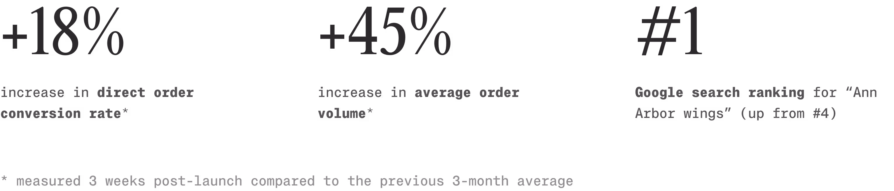
We measured impact 3 weeks post-launch, comparing performance to the previous 3-month average:
18% increase in direct order conversion rate
Improved visual hierarchy, accessible CTAs, and clearer navigation reduced friction in the ordering experience.
45% increase in average order value
Better product presentation (e.g., sauce showcase with descriptive badges and clearer information) helped customers explore offerings and order with confidence.
#4 → #1 ranking for " arbor wings"
Incorporating SEO helped improve discoverability in local search results.
Reflection
This was my first time implementing my designs on a live site. With limited coding experience, I learned to account for technical constraints early, especially within Square’s JavaScript limitations.
What began as a class project turned into a real launch through cold-emailing the owner of a restaurant I love. Collaborating directly with Jordan taught me to balance design principles with business needs, finding compromises like clearer typography and keeping delivery options while guiding users toward direct orders. Bringing this to life for a local business made the project especially rewarding.