Side Biscuitcase studyshipped
Side Biscuit
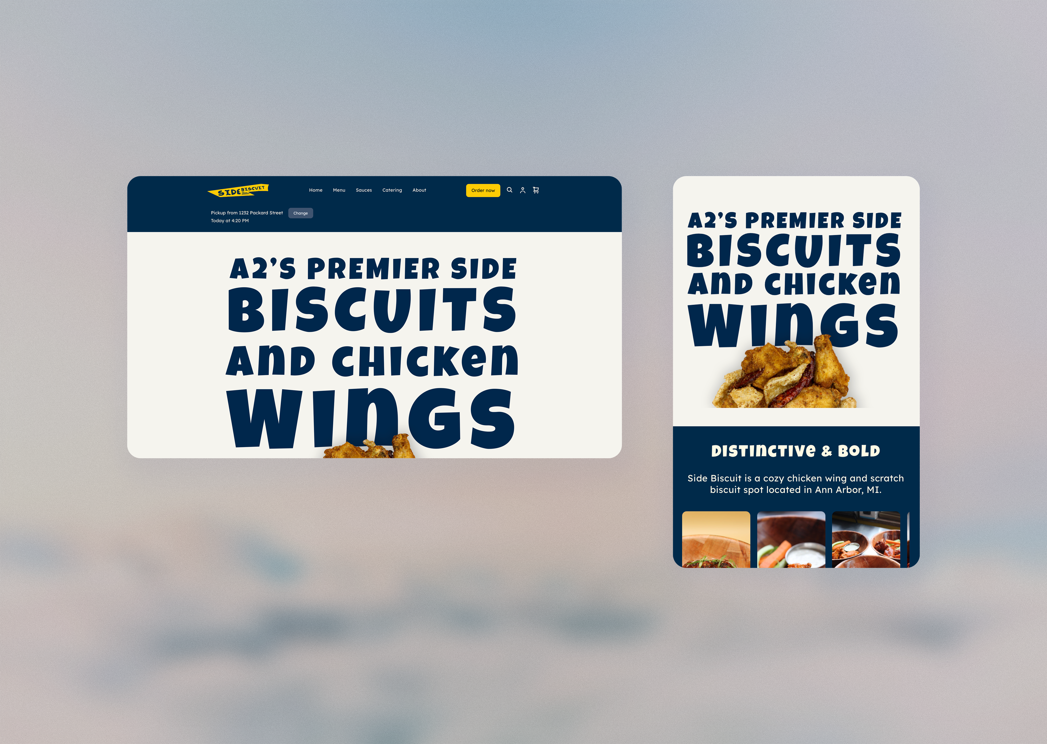
Redesigning a local restaurant's website to move customers from third-party delivery apps to direct online ordering.
Overview
This is a website redesign for Side Biscuit, a local restaurant specializing in chicken wings, based in Ann Arbor, MI. I was the UX Designer and developer. Within 2 months of launch, the website incurred an 18% increase in conversion rate, a 23% increase in total purchase amount, and a jump in Google search ranking from #4 to #1.
Context
Our client noticed that many customers were placing in-store pickup orders using third-party delivery apps and wanted to promote direct online ordering alongside refreshing the website, since it had not been updated in 4 years. I worked in a team of 3 to redesign the website. I was responsible for redesigning the Home page and implementing the changes onto Square.
My role encompassed the entire design process. I worked with my teammates to audit the existing website and identify accessibility concerns. I took full responsibility for the design of the Home page, which consisted of refining the flow, designing the final UI, and implementing the design changes onto Square.
Constraints
No research budget
No research budget meant we couldn't conduct formal user research; instead, we relied on heuristic analysis to evaluate usability issues, particularly around the client's core concern of shifting customers away from third-party pickup ordering.
Square's limitations
The site is hosted on Square. This meant that the checkout was built around a third-party payment provider we couldn't replace; instead of rebuilding the entire flow, I focused on aspects of the experience that could be controlled — improving the information hierarchy and reducing the confusion of ordering directly versus through third-party platforms.
Brand guidelines
Some of the client's brand guideline requirements raised WCAG accessibility concerns. We worked with the client to find alternative options that preserve the brand's identity and conform with web accessibility standards.
Research
Research goals
Since we didn't have access to ordering metrics, we couldn't confirm how much of the restaurant's pickup volume was flowing through third-party apps or why. Hence, we ran a heuristic evaluation to identify usability issues in the direct-ordering experience that could plausibly explain the pattern, and looked at comparable restaurants to see how they'd approached the same problem.
Key finding
The direct-order CTA got lost among competing signals. Since it was positioned alongside third-party delivery app buttons and rendered in low contrast against the background, it had to compete for attention instead of standing out as the obvious choice. This shaped my design decision to make the direct-order button the most visually salient element on the page.
Design decisions
Brand guidelines
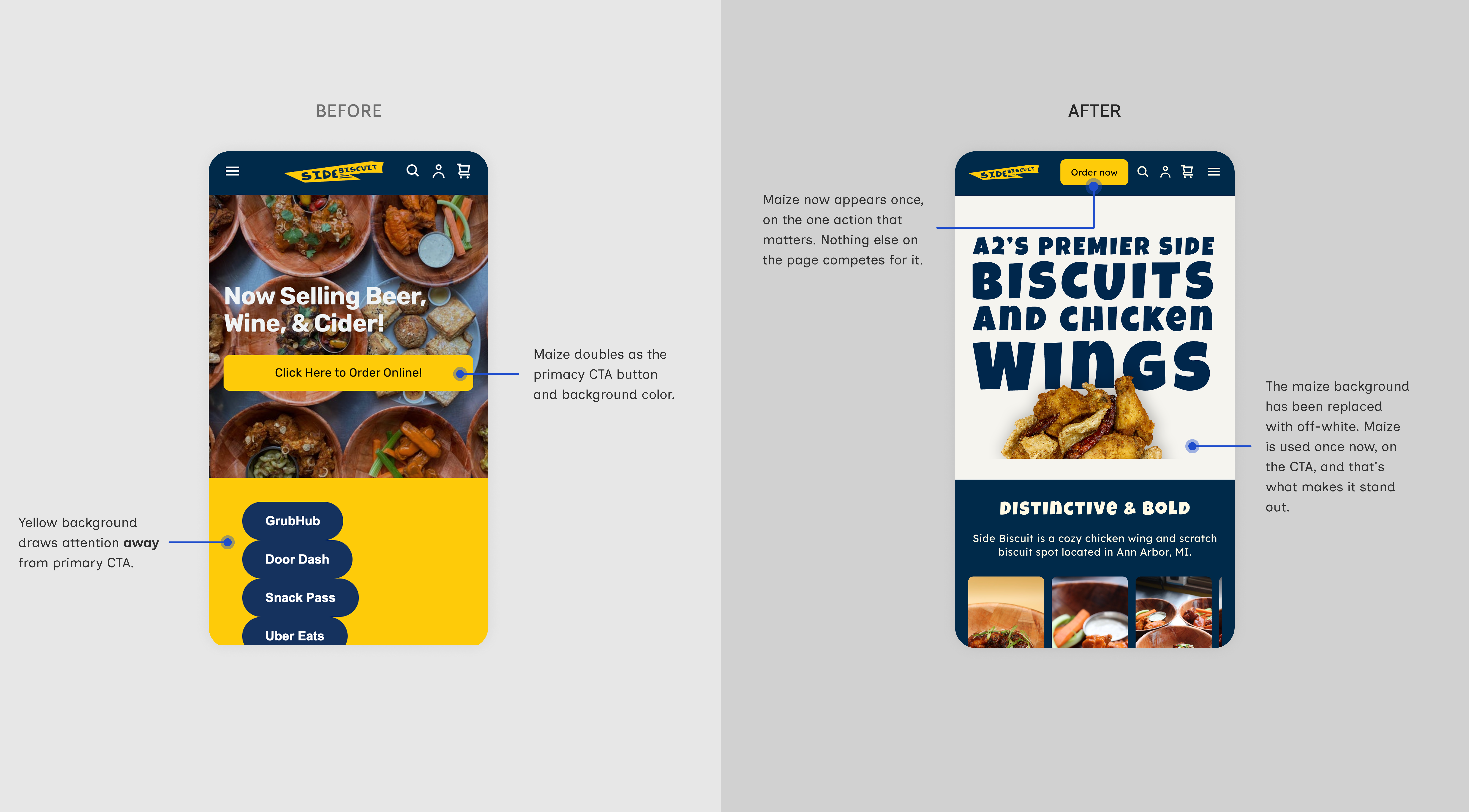
Our client requested to use the University of Michigan colors (dark blue and maize) throughout the site to pay homage to the local community their business serves. Maize and blue appeared everywhere on the page, but never with intent. The background, the nav, the delivery buttons, and the direct-order CTA all drew from the same two colors, which left the button that mattered most competing with its surroundings instead of standing out from them. That may be part of why customers weren't ordering pickup directly.
I stayed as close to the original request as I could. I chose a lighter tint of maize to be the primary color alongside the dark blue, while preserving maize for primary CTAs. The palette still reads as Michigan, and the boldest color now appears only where it needs to pull attention. The client reviewed the alternative and agreed.
Primary CTA
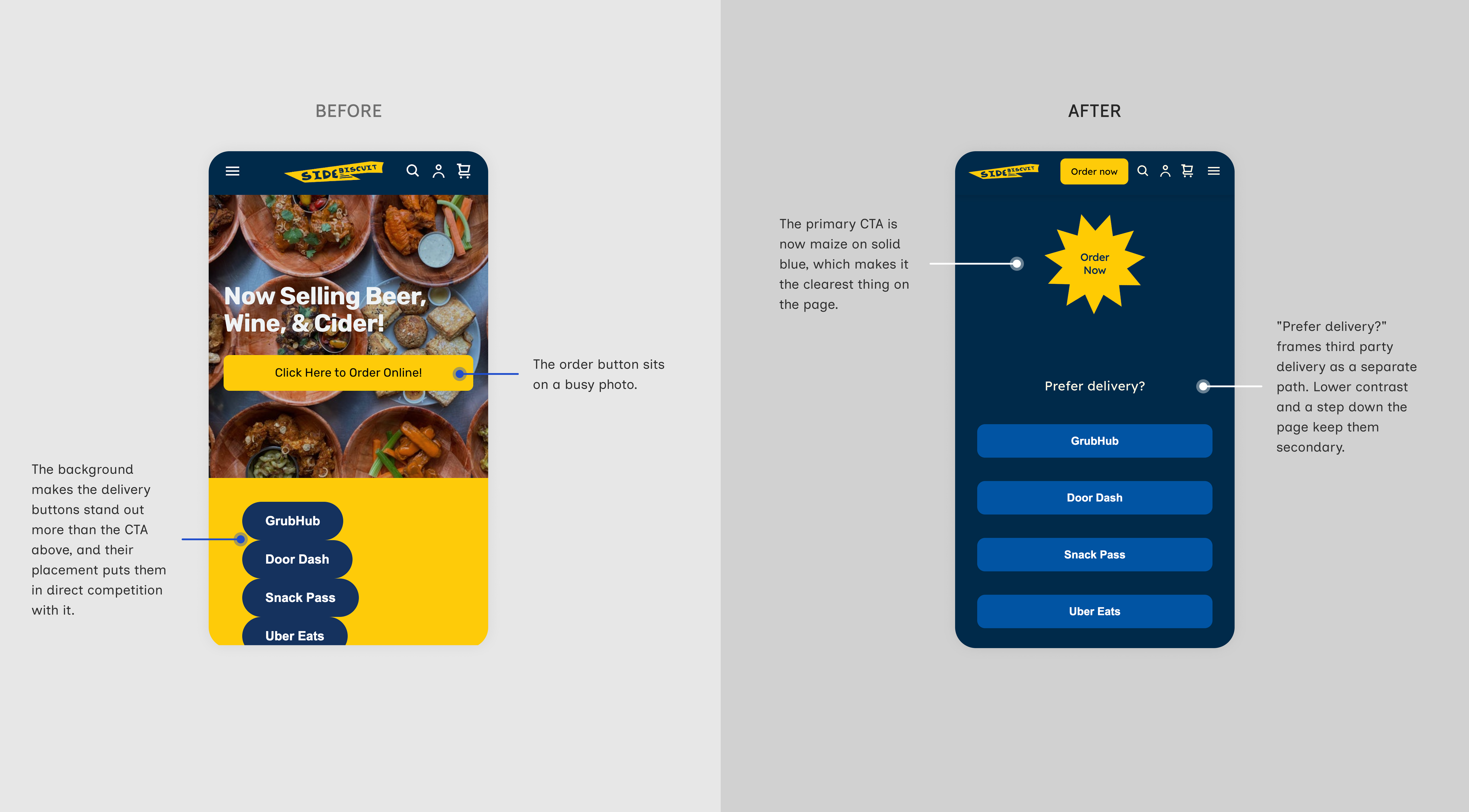
During the heuristic evaluation we found that the direct-order button sat on top of a busy food photo, which flattened its contrast against the background. Below it, the third-party delivery links sat on a solid maize field where they read clearly. Nothing marked ordering direct as the preferred path, so customers had no reason to choose it over the app they already used.
My first recommendation was to remove the third-party options entirely. The client pushed back because they wanted first-time visitors to know delivery was an available option. That was a case I hadn't accounted for, and it shifted the problem from what to remove to what to prioritize.
So I kept the options and rebuilt the hierarchy instead. The direct-order CTA became maize, the only element on the page using it. Below it I included “Prefer delivery?” to introduce the third-party platforms as a separate, secondary path. Customers ordering pickup get one obvious button; customers who want delivery still find it, one step down.
Outcome
After launching the changes, the site saw the following results within 2 months, compared to the average of the past 6 months:
Reflection
This was the first project where I had to implement my own designs. I have to be honest — I'm not the best at coding, so during the ideation phase I limited myself by focusing on what I believed I could technically achieve. In the future, I'll approach this differently, with a more open mindset (since vibe coding tools are now available, my technical limitations can't stop me).
If I could go back and give myself advice before starting this project, I'd tell myself to look into the technical limitations of whichever platform the final product exists in — in this case, Square. Square tends to compress advanced JavaScript, which results in some animations not running. Towards the end of the project, my team and I had to scrap some animations we wanted to implement because we had to launch the site within our client's specified timeline.
If I had more time to work on the project, I would try to find workarounds to implement the animations we had planned for the site.